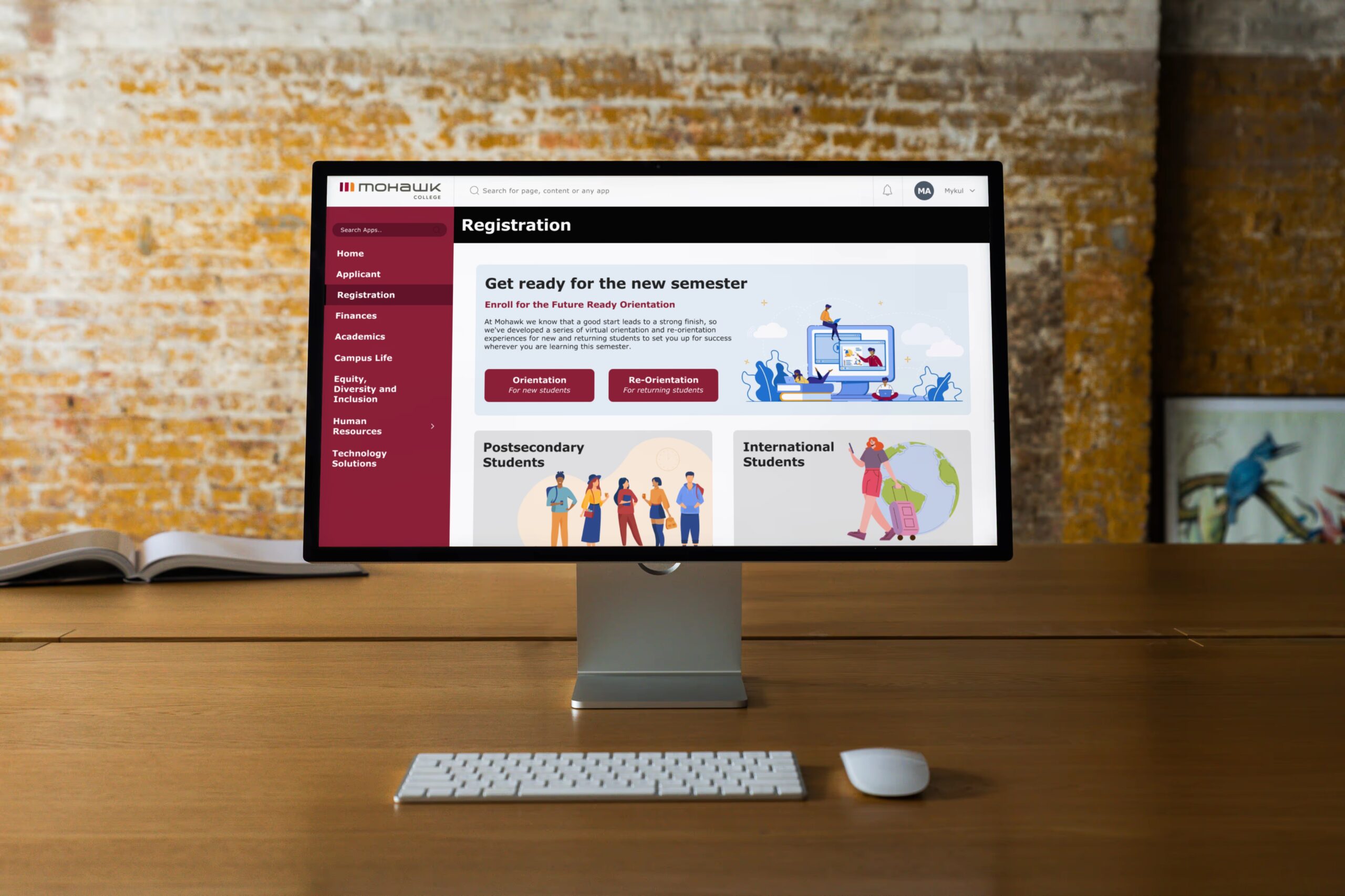
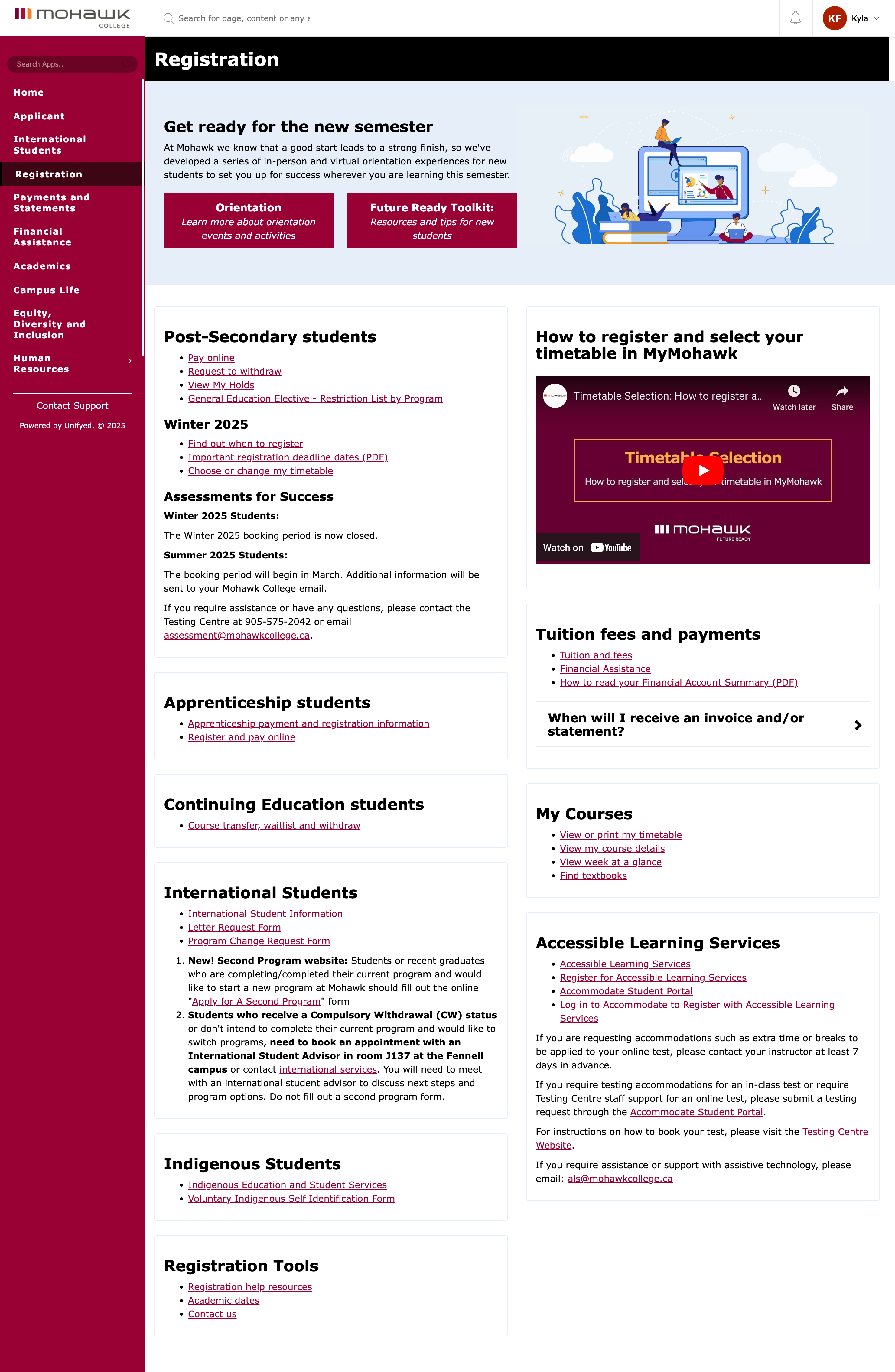
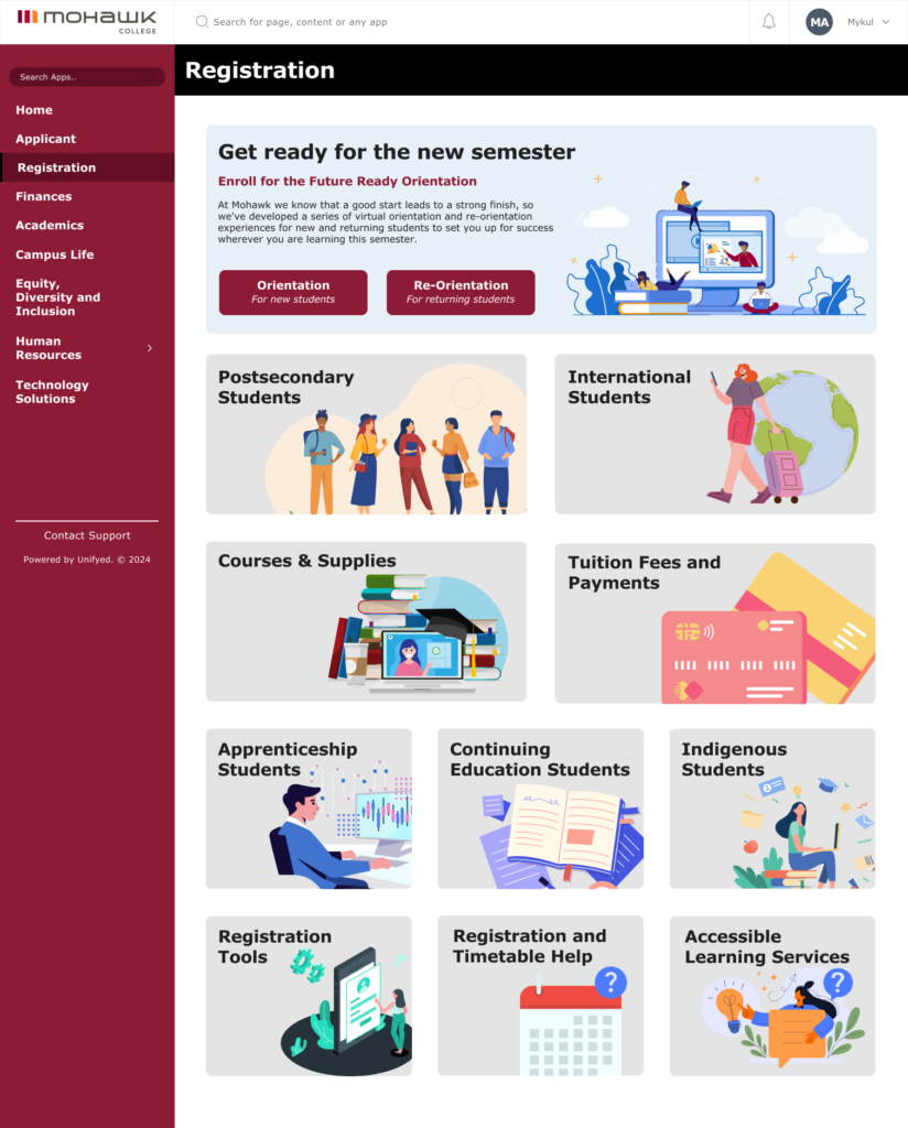
The goal of this project was to redesign and enhance the Mohawk College website. Our focus was on creating a user-friendly, visually appealing, and informative platform. For the Registration section, we incorporated engaging visuals and large text to highlight key topics. Additionally, we designed an interactive prototype where users can click to expand sections, revealing options in a way that avoids overwhelming them. This project was developed using Figma.
Research
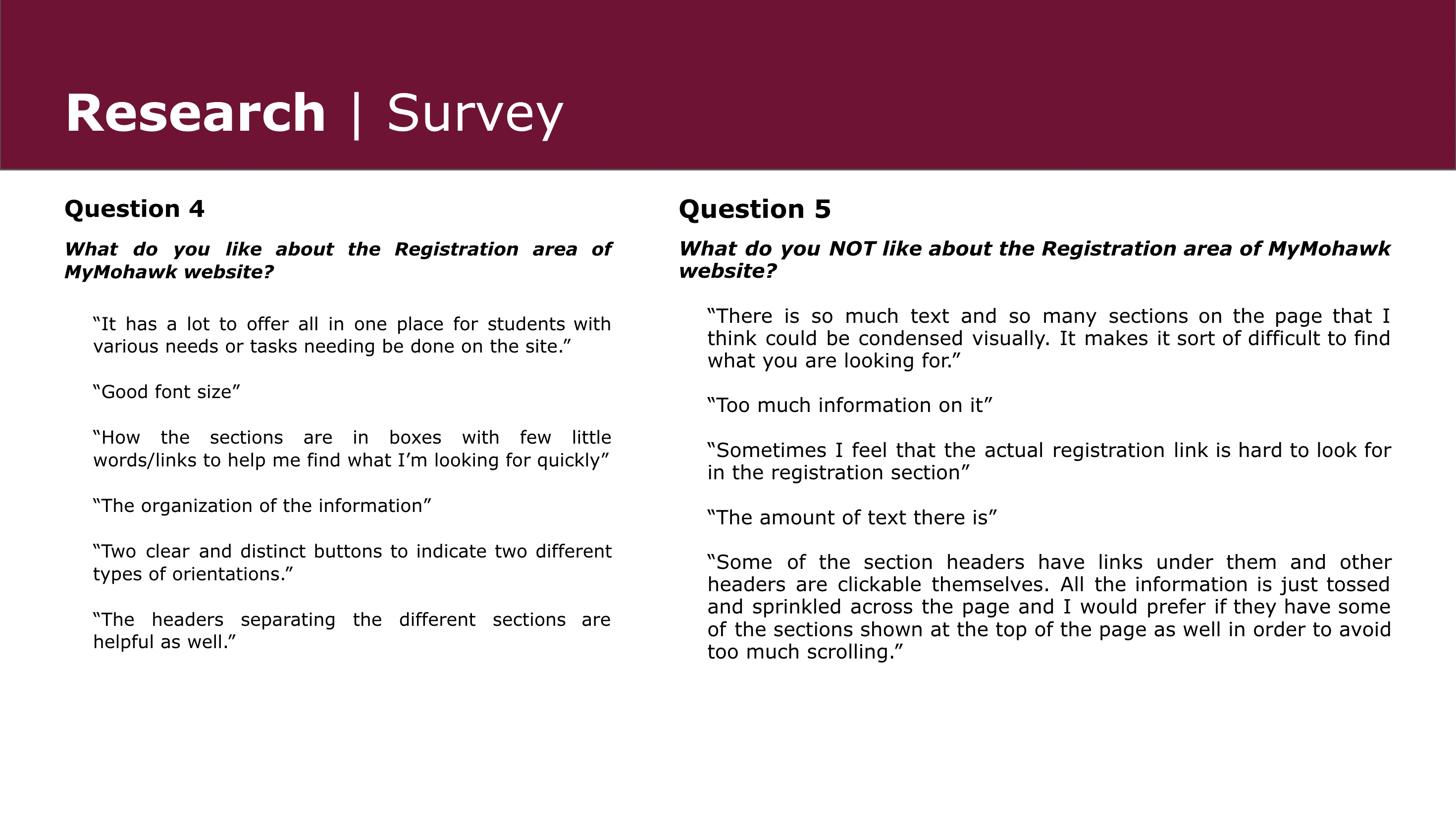
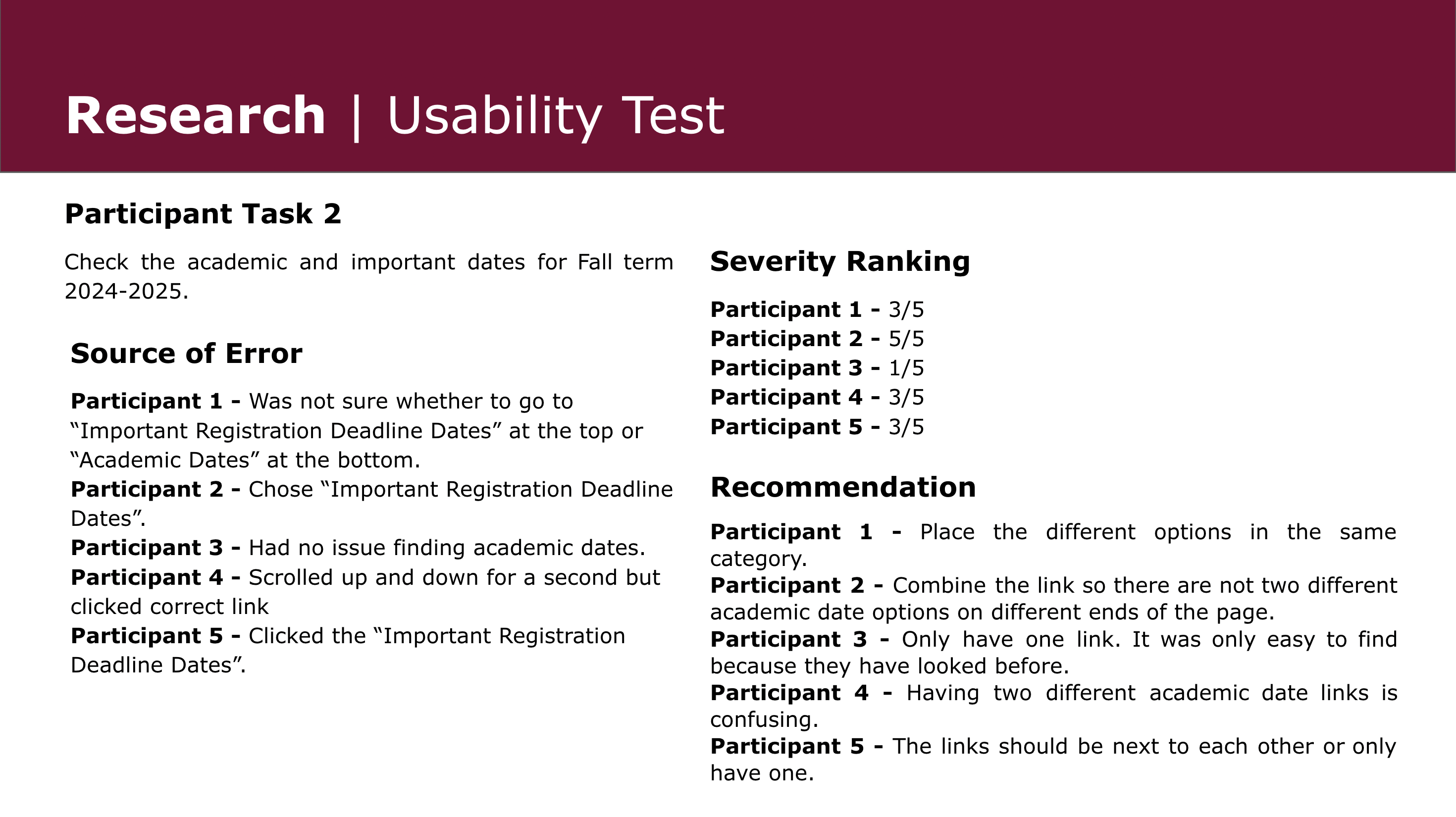
For our research, we utilized both surveys and usability testing. We discovered that the primary concern with the website was the overwhelming amount of text, leaving users unsure where to start or how to find the information they needed. In our redesigned version, we addressed these issues by incorporating more imagery and a cleaner, more organized layout. Additionally, we created an interactive prototype with expandable sections to minimize confusion and enhance the user experience.